Path — Paving a new path for employees
A website that helps connect employees with employers through an easier more efficient avenue.
My role:
My partner, Olivia Shapiro, and I were known throughout our last semester of our undergraduate degrees as the “dynamic duo” and I think that was shown throughout this project. We have been known to work well together with continuously bouncing ideas off of one another.
Throughout this project we worked together on just about every section. We first began the project by making a style guide where we shared a Canva team to piece together a color palette, the typography, mission statement and tagline.
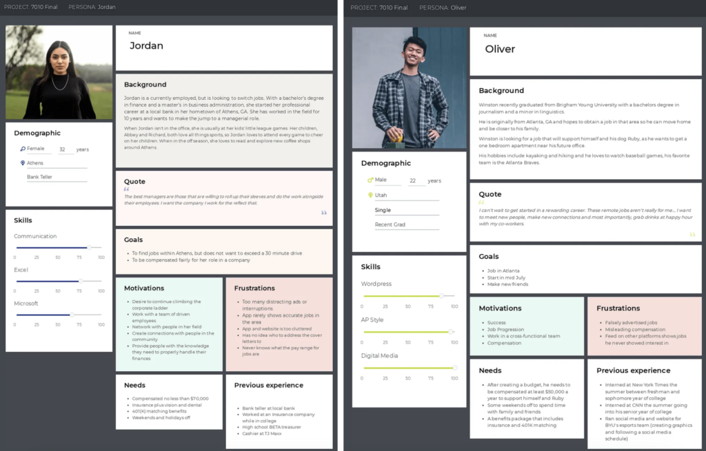
We also shared Adobe files where we both worked on our pictorial and word mark. Then we created a persona each, Olivia created Oliver and I created Jordan.
After that, we created the journey map and the prototype. It is difficult to look back and say that one person was dedicated to doing X while the other worked on Y because in reality, we spent hours on Zoom where we would collaboratively work on every detail.
Overview:
As a recent graduate navigating the full-time job market, I’ve found the experience both grueling and frustrating. With profiles on major platforms like Indeed and LinkedIn, I’ve spent countless hours scrolling, tailoring cover letters, re-entering resume details, coordinating interviews, and sifting through misleading job postings. I realized I wasn’t alone in this struggle. The user experience for job seekers desperately needs enhancement—ideally, an amalgamation of the best features from existing platforms. Together with Olivia, we decided to tackle these issues head-on, aiming to create a more user-focused job search platform that simplifies and alleviates the stress of the job search and hiring process.
Background:
The leading job search platform is Indeed, attracting over 300 million unique visitors each month. We appreciate its user-friendly features, such as the ability to save job listings, upload an updated resume, set specific search parameters, and use the “easy apply” function. In our view, Indeed offers the most user-centric experience. LinkedIn follows closely with 310 million monthly active users; we value the similar options such as saving job listings and uploading resumes and other documents as well as networking opportunities it provides. LinkedIn is our favorite platform. Handshake, designed for students, serves 18 million users and offers the convenience of linking accounts through educational institutions, though it hasn’t been our go-to platform. Lastly, Glassdoor, with 67 million monthly visitors, is another platform we mention but seldom use.
As part of developing a user journey map, we crafted two distinct personas representing diverse backgrounds: one seeking a career transition and another eager to launch a career straight out of college.
Both individuals are in search of a comprehensive, transparent job searching platform. They desire a service where they can craft visually appealing profiles and directly engage with hiring managers. Ideally, this platform would enable them to submit applications, communicate with potential employers, and conduct interviews all in one place, eliminating the need to navigate through multiple video chat platforms commonly used by companies. This streamlined approach aims to simplify the job search process, making it more efficient and user-friendly.

User Journey Map:
The user journey map presented below illustrates the experience users will have with our innovative job platform, Path. This journey shows a progressive upward trend as job seekers create their profiles, receive messages from hiring managers, and complete interviews, all within a single platform. The experience culminates positively, with users departing the platform having successfully secured a job.

Design: When visiting the Path website, individuals find the home page with the option to either log in or to create an account. Below the login square we added our company tagline “Find your path,” in hopes to fill the new customer with hope and optimism.

Three Key Components:
Aware that we weren’t alone in our job search struggles, we devised a Google Survey and distributed it among friends, peers, colleagues, and across our social media networks. The survey requested participants to share their current occupation and other self-identifying information, and included a series of yes/no questions to capture their insights. We received a broad range of responses, not just from job seekers but also from individuals who had experience hiring candidates. Analyzing this feedback, we identified three critical features to focus on as we embarked on designing a new and enhanced job searching platform.
Profile Page:
We designed our platform to help job seekers craft an engaging and straightforward profile page that not only presents crucial details about the candidate to hiring managers but also highlights significant background and personality traits.
Recognizing the burden of constantly updating resumes and manually inputting data across multiple platforms every time a job seeker gains new experience or completes a project, we simplified the process. Our solution allows users to upload their resumes and cover letters in an attractive, streamlined format, eliminating the need for repetitive data entry in a “resume section.” This convenience extends to hiring managers and recruiters, who can easily review and download these documents.
Furthermore, we have emphasized soft skills, understanding their vital role in enhancing a candidate’s attractiveness to potential employers.
Ultimately, our goal is to remove the tedious task of manual updates for job seekers and to equip employers with a more efficient method for identifying candidates who are well-suited for their company culture. This enhancement also aims to foster more tailored and effective conversations during the interview process, benefiting both employers and candidates.

Our inspiration for this page stems from our observations of what works and what doesn’t on other platforms. We’re introducing the capability to conduct multiple job title searches and establish “Definite No’s” parameters to exclude listings containing specific keywords.
Like on other platforms, job listings are displayed on cards. Here, you can save jobs, expand listings for more details, and click an “apply now” button that shares your profile with the hiring manager, with an option to attach a cover letter tailored to the job.
Another ambitious feature involves requiring job listings to include pay ranges, salaries, and hiring manager details, areas often overlooked or omitted. We also want clearer information on start dates and benefits. While this may seem like wishful thinking, mandating such details would streamline the process for both job seekers and hiring managers. There’s no point in pursuing a candidate if the salary, start date, or benefits don’t meet their needs. Similarly, job seekers shouldn’t waste time on a position that doesn’t meet their criteria. Including hiring manager information could personalize applications—though we contend that the tradition of tailored cover letters might be outdated.
We recognize these proposals may be considered what our generation calls “hot takes,” but survey results showed a strong preference for greater transparency from both job seekers and employers.

Integrated Interview Platform:
We recognize that while platforms like LinkedIn have video chat capabilities, they are underutilized. Instead, Zoom, Google Meets, and Microsoft Teams dominate the scene, often leading to confusion for job seekers who must juggle interviews across various platforms.
To streamline this process, we propose an integrated video chat feature within our platform, Path. This feature is part of our broader vision to include a calendar specifically designed for managing job interviews. This unified system would allow job seekers to track and schedule interviews in one dedicated place, while hiring managers could use the same tool to organize their appointments, directly scheduling interviews onto a candidate’s calendar.
Although job seekers likely have accounts across all major platforms, our goal is for Path to serve as a central hub. Hiring managers would use Path’s messaging feature to contact prospective employees and schedule interviews. These appointments would then automatically appear on the job seeker’s calendar on Path. This consolidation aims to eliminate the confusion and hassle of managing multiple interview invites from various companies, particularly when multiple interviews occur within a short time frame.

Further Ideation
Integrating AI:
With the rapid advancement of artificial intelligence, it would be silly not to harness this technology for Path. We are considering integrating AI to enhance the job search functionalities. As a learning model, the platform would analyze patterns and monitor job application submissions, adapting to the preferences and dislikes of job seekers to customize their search experience. Additionally, we plan to incorporate a feature similar to “ChatGPT,” enabling job seekers to generate personalized cover letters with AI assistance, a practice that is becoming increasingly common, directly on the platform.
Tinder — a job match made in Heaven:
Imagine a Tinder-style app for job searching. While similar concepts have been attempted before without success, understanding past failures through thorough research and discussion could pave the way for a more successful iteration. Such a platform could offer a lighter, more engaging job search experience, transforming the way users look for opportunities—turning idle time spent scrolling through TikTok in bed into productive job exploration.
Shadowing platform — Opportunities for high schoolers:
One thing I regret not doing in high school is shadowing professionals across different fields to more quickly identify my interests and rule out unsuitable career paths. A dedicated platform designed for high school students could facilitate this exploration by connecting them with professionals open to offering shadowing opportunities or internships. This would enable young students to discover their passions and interests before potentially making an uninformed choice about their college major, only to realize midway through that it doesn’t align with their true passions.
User Research:
As previously discussed, incorporating a calendar page for both job seekers and hiring managers could significantly streamline the scheduling and execution of interviews. Centralizing these functions within our platform eliminates the need to rely on other platforms for arranging and conducting interviews, ensuring that this feature remains front and center—unlike its underutilized counterpart on LinkedIn. In fact, when we surveyed users about their awareness or use of LinkedIn’s similar feature, every respondent indicated they had neither used it nor knew it existed.
Conclusion:
People, technology, and lifestyles are constantly evolving. Users today seek easier and more efficient ways to manage their daily activities—from grocery shopping at home to enjoying same-day or two-day delivery for nearly anything they need. Similarly, the process of job searching and the transparency within it should also progress. With additional research and ideation, a platform like Path could emerge as the ultimate one-stop-shop for job searching, emphasizing user-friendly accessibility for both job seekers and hiring managers/recruiters.
To view high resolution photos and access link to Figma prototype, click here.
